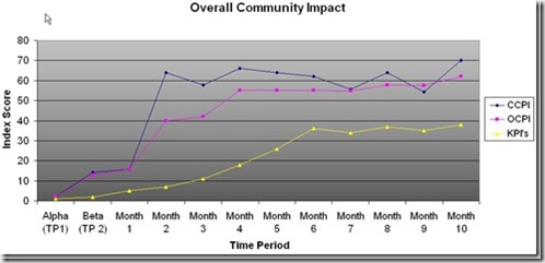
Below is a real excerpt example taken from a CPI (Consumer Performance Index) dashboard.
Why am I showing this? Simple. If you can not articulate and defend the value your community is delivering to your organization (note I don’t say brand), you do not know the value of your community.
Let me repeat this. Ok, just read it again. it’s important. Write it down, print it out, tattoo it on the inside of your eyelids.
If you can rise to this challenge, you will be way ahead of the game. Why? Communities fail because the people planning them and running them have no idea that they are failing and later, amidst the smoldering wreckage of that failed ‘experiment’ they haven’t a clue as to what got them there.
Going in and asking for more money to try it again may be difficult if the only answer you can give is ‘ummmmm…’
If, however, you make a different presentation that shows to senior management areas you are failing and what you need to do about it, as well as, where you are succeeding and what that means, you will get a very different reaction.
The by-product is you will have (or at least have a better change in getting) the tools you need to deliver against your brand’s (including community) promise.

So above is a community performance index snapshot. Note the indext tracks three things related to this community.
1. The current community performance index score of a community (see CCPI, month 10). This is essentially where we are today in relationship to where we have been (without being able to compare where we are with a trend line AND key performance indicators, measuring where we are today by itself is pretty meaningless).
2. The overall (or aggregate performance) index score (see OCPI, Month 10). This is where we have been (and telegraphs where we are going).
3. The relevant KPI’s (Key Performance Indicators) that this brand is interested in tracking/moving. If you have a community associated with your brand, this is very, very important!
These would include, but are not limited to:
- Sales
- New users
- Campaign participation
- CRM activity & cost savings
- Community participation
- Registered members/active members
- UGC creation & location
- Actionable feedback
Note that over time things improve. This performance improvement correlates to membership, activity, integration with traditional mar/com, the product itself and of course community functionality aligning with member need.
In any community the performance will ebb and flow. This ebb and flow can be caused by a number of things from time of year/seasonality, increase in membership to functionality, quality of content even brand support and community visibility to new products being launched to the company making the news.
For instance, note Month 3. A big drop for that month. What drove that? In this instance, it was driven by four things:
– A major holiday season
– A gap in community challenges
– A refocus of outbound CRM activity that did not include community UGC
– A lapse in community recruitment (by advocate type)
Of equal importance, look at what happened in months 7-10. See the drop-uptick-drop-growth jump? What happened here? More of the above? Another holiday?
Nope. It was two different but very specific things. During this time, community functionality was refreshed, however, some of what was deployed was slightly off the mark in terms of its utility. Members tried it and told us specifically what was wrong (feedback). It was quickly fixed and re-deployed. This time it was on the mark, and the results show (see months 9-10).
Notice that the effect on the overall performance of the drop caused by the functionality was essentially nil. That’s because the problem was isolated and dealt with quickly.
Community managers can view this data a number of ways, allowing them to drill down into what’s behind the numbers. This helps with both reactive problem solving and pro-active planning.

Each has three numbers; a current performance number (CCPI), an overall performance number (OCPI) and a KPI number. Each number is color coded to indicate its relationship to an established benchmark. Red. Yellow. Green. In case you were wondering, green is the preferred color.
A change in status (color) such as in the CCPI number shown in month 2 should indicate imminent changes in both the OCPI (month 2) and of greater importance, the business KPI’s (month 3).
Community managers can click on any of these numbers (or data points on the dashboard graph and have access to the category and performance numbers that are driving the index score during the time period they are interested in.
For instance, in the Advocacy category of the Index, there are four sub-categories which track and measure approximately 30 specific indices, so marketers can quickly hone in on what is driving certain results and quickly take the appropriate action.
For most, this is a mind numbing amount of data, which is why the collection and display of all of these numbers should be a web service.
For the community manger, what’s important are the scores and the trending. And when necessary, being able to quickly isolate and act on what is driving those numbers.
The index score is also be tied to community content, some of which is feedback oriented. This ‘humanizes’ the numbers. Also, the community verbatims and UGC tracks with your Index and KPI scores, which helps when presenting to others within the company.
If the UGC and Index scores don’t align, you have an issue…or more likely may have one very soon. UGC is a very good ‘canary in the coal mine’, providing a effective early tell-tale sign that there is an issue brewing.
Your community management activity should include other listening tools, such as those provided by companies such as Visible Technologies or Sysomos. This combined with the Performance Index gives a great deal of control to the marketing team.
From the community member’s perspective, none of this is visible…or should be. It’s not that we want to hide it from them, it just isn’t germane to the community participant’s experience.
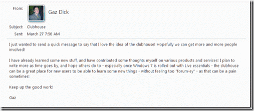
An analog to this is Disneyworld. Underneath the park are a myriad of tunnels. Behind the walls of the castles and rides are a slew of computers and monitoring equipment. All this is needed for the above-ground Disney experience to deliver the ‘wow’ factor it consistently does. Great community, with the proper tools generates results, as the below illustrates.

(It is important to note that for the integrity of our client’s data, none of the information shown comes from any single community but rather a mash-up of a number of them.)
If you are responsible for community or participate in the design and support of one, ask yourself a question. Does performance matter? If it does, how do you measure up?

